Service Hub — UX Case Study
“A trusted platform to connect customers with reliable service providers, and empower vendors and admins with full control.”
1. Background
Service Hub is a three-sided digital platform designed to seamlessly connect customers, service vendors, and administrators in a single ecosystem. My role was to lead the end-to-end UX and UI design, from research and ideation to prototyping and developer handoff.
This case study outlines how I designed an intuitive, trustworthy, and scalable system by putting user needs at the core of every decision.
2. The Problem
n Sri Lanka, there’s currently no unified digital platform that connects local service providers (like electricians, cleaners, tutors, or photographers) with clients in an open, transparent, and secure way.
Unlike platforms such as Fiverr or UrbanClap that are available in other countries, Sri Lankan customers and vendors still rely heavily on word-of-mouth, Facebook groups, or WhatsApp chats to find and offer services. This brings several issues:
Lack of trust between clients and vendors — no reviews, no verification
No transparency in pricing — customers often don’t know if they’re being overcharged
No centralized bidding or negotiation — everything happens privately
No admin control — no one to resolve disputes or ensure service quality
Limited exposure for vendors — skilled local professionals struggle to find steady clients
This gap in the market led us to design Service Hub, a platform made for Sri Lankans, that enables open service bidding, clear communication, and a transparent 3-way system — connecting customers, vendors, and admins — to build a safe and trusted service environment.
4. My Goal
For Customers:
Easily find trusted service providers
Book services quickly and effortlessly
For Vendors:
List their services with ease
Track leads and chat with potential customers
Improve their visibility on the platform
For Admins:
Review and manage user accounts
Handle and resolve reports
Ensure platform safety and trustworthiness
3. My Role
I worked as the solo designer, doing:
User research (interviews & surveys)
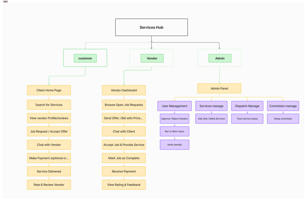
Personas and flow planning
Wireframes and high-fidelity design in Figma
Creating design components
Developer collaboration for handoff
4. Design Process

5. User Research and Insight
I interviewed:
-
5 customers who had used online service platforms
-
3 small-scale vendors (like photographers and electricians)
-
1 business admin managing service platforms
I also studied apps like TaskRabbit, Thumbtack, Fiverr, and UrbanClap.
What I learned:
-
Users want clear communication, trust signals (reviews, verification), and real-time updates.
-
Vendors want dashboard simplicity, fast payment, and the ability to track work orders.
5. Brainstroming
Before jumping into wireframes, I explored multiple ideas for layouts, flows, and features through quick sketches and team discussions. My goal was to keep the platform:
Simple (even for first-time users)
Trustworthy (build confidence with vendors and admins)
Useful (with the right features for each user type)
Key Brainstormed Concepts:
A home page that adapts based on whether you’re a customer or vendor
Smart filters for location, service type, and availability
A 2-step booking process (instead of traditional long forms)
One dashboard per role (Customer, Vendor, Admin) with tailored tools
Ratings and verified badges for vendors to build trust
Quick reports for admins with user flagging and ticket actions
6. Personas – The typical users I designed for
Due to time constraints and budget limits, I didn’t conduct a large-scale persona mapping exercise. Instead, I focused on speed and relevance, drawing insights from real, accessible users who closely represented our key audience types.
I reached out to people in my own network—friends, freelancers, and local professionals—who had real experience as:
Customers looking for services
Vendors offering their skills
Admins or business owners managing listings or support
While not statistically exhaustive, these contacts gave me direct, honest feedback that reflected real behaviors, frustrations, and needs
7.Designing for Simplicity, Trust, and Clarity
With these insights, I sketched out an early hypothesis: if we can make trust visible and the platform intuitive for all three roles, we can reduce friction and build confidence. This would mean different tools for different users — but all living inside one seamless experience.
I explored ideas like 2-step booking flows to minimize friction, verified badges to signal trust, and role-based dashboards so users only see what matters to them. Early wireframes reflected these principles — no clutter, just clear paths to action.
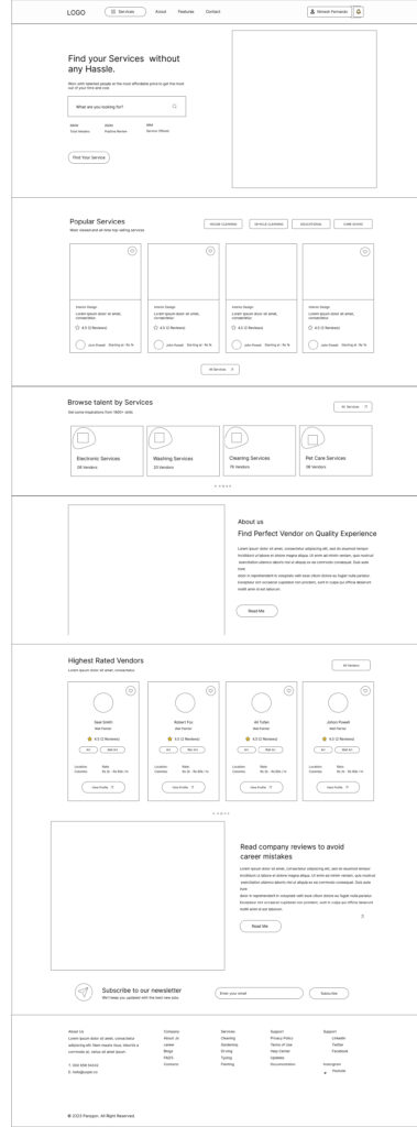
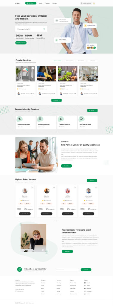
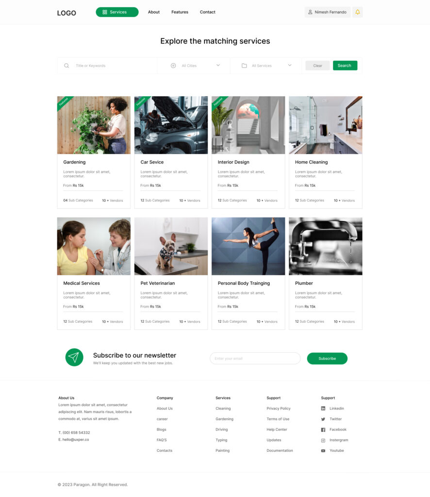
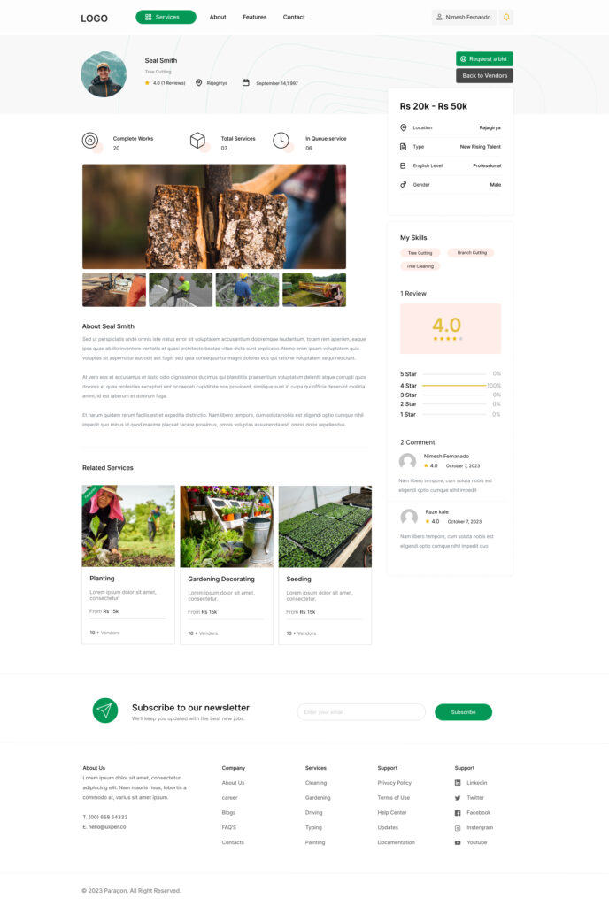
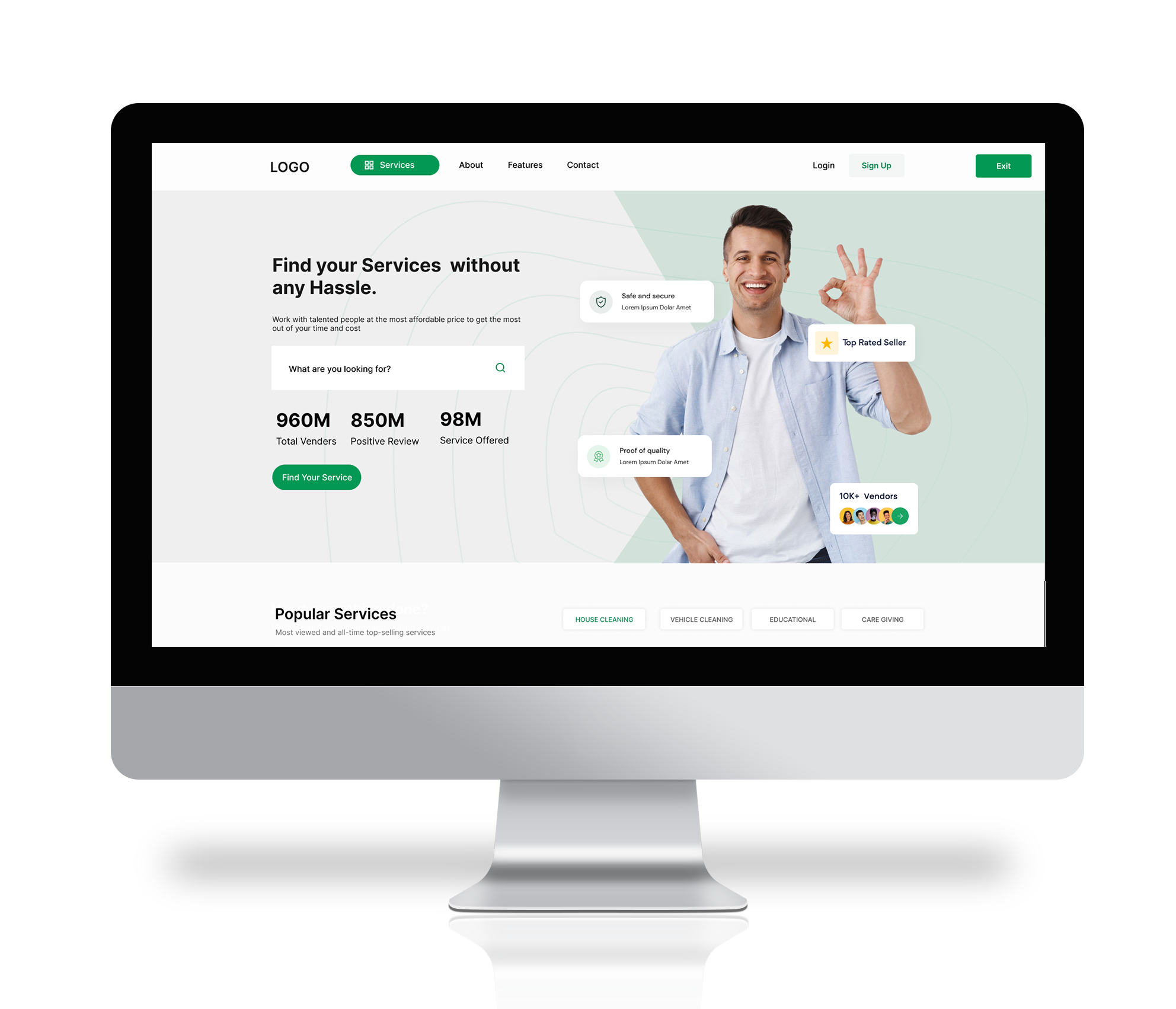
For example, customers would land on a clean homepage with smart filters: service type, location, and availability. From there, they could view vendor profiles with ratings, reviews, and a visual portfolio. Booking would take just a few clicks.
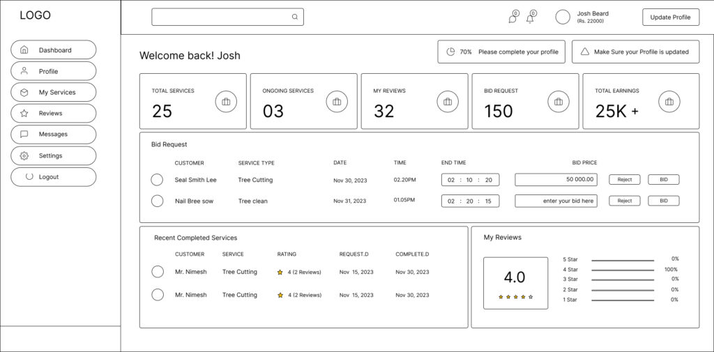
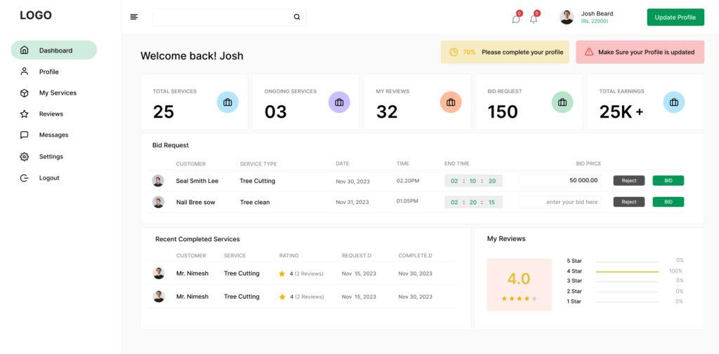
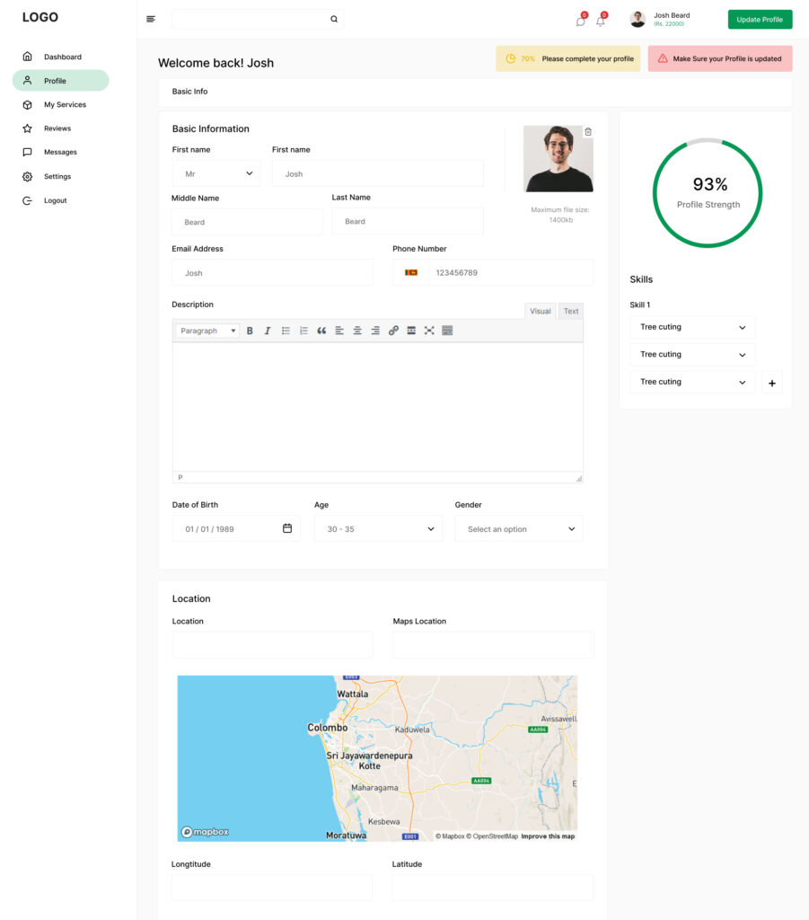
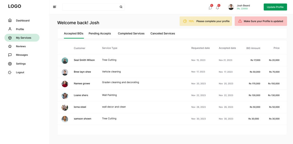
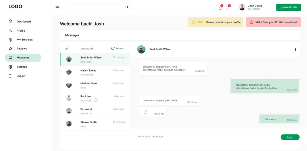
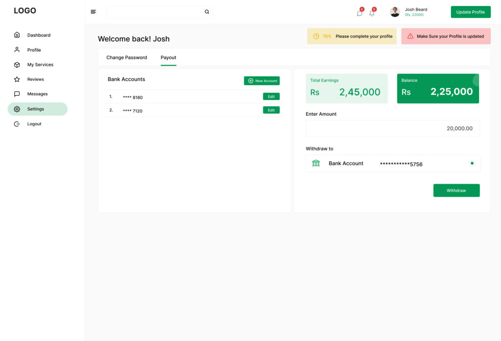
Vendors, on the other hand, would see a focused dashboard showing leads, bookings, chat history, and performance analytics. This meant they didn’t need to switch between multiple apps just to stay organized.
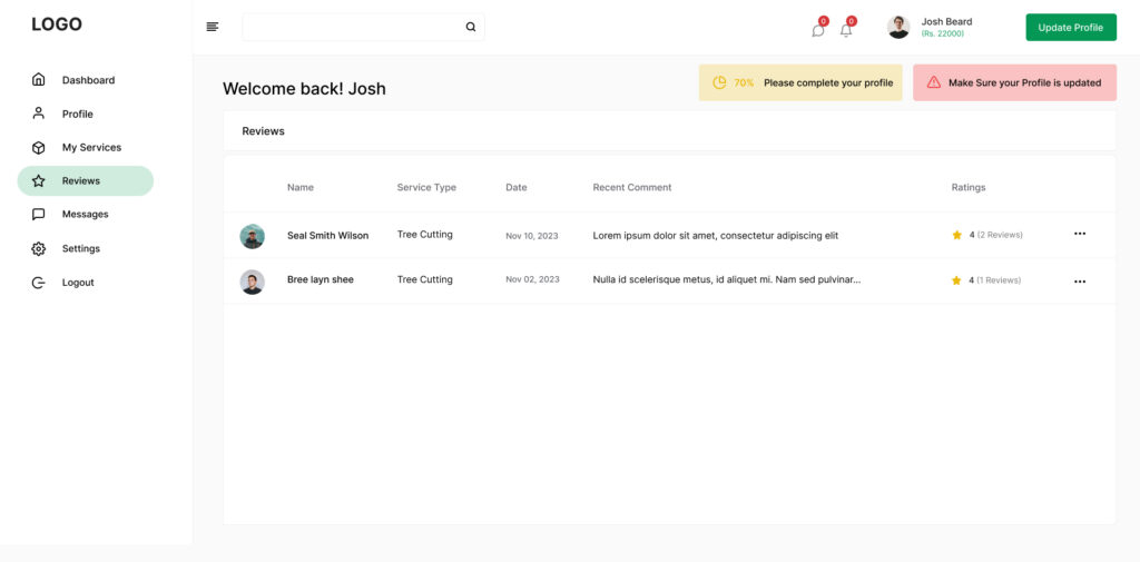
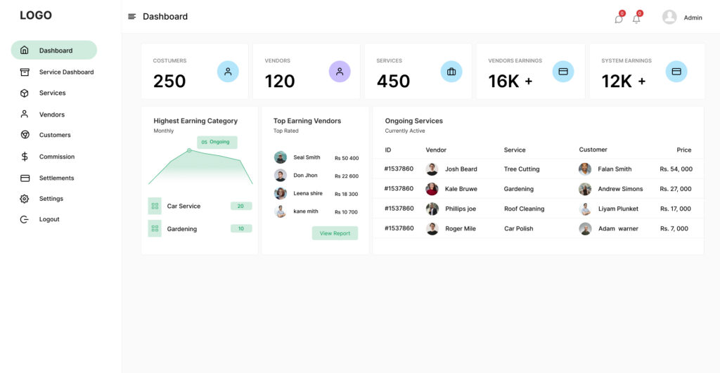
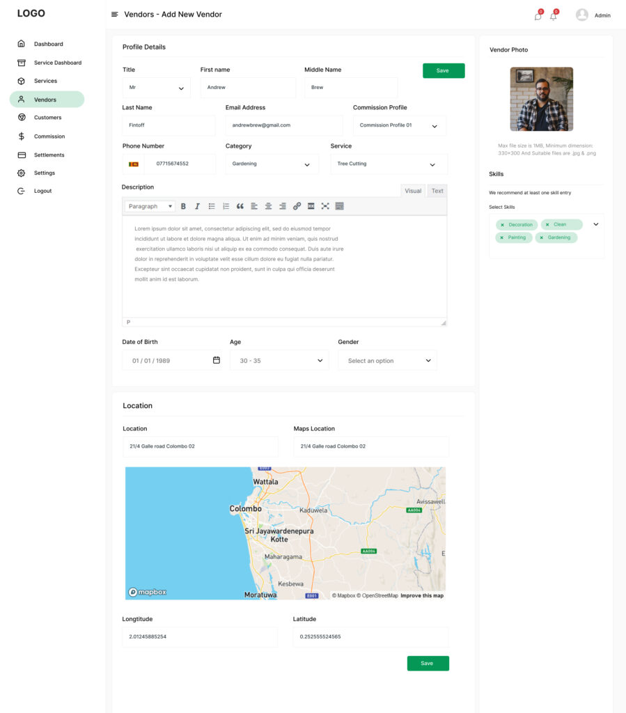
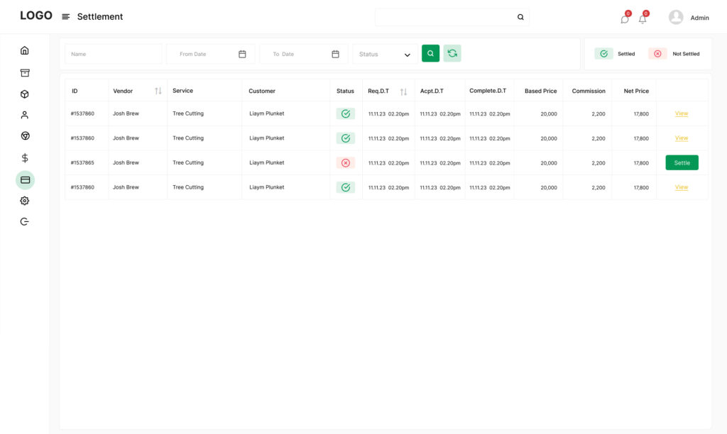
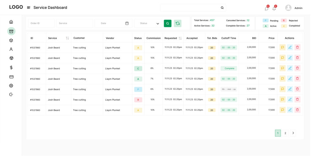
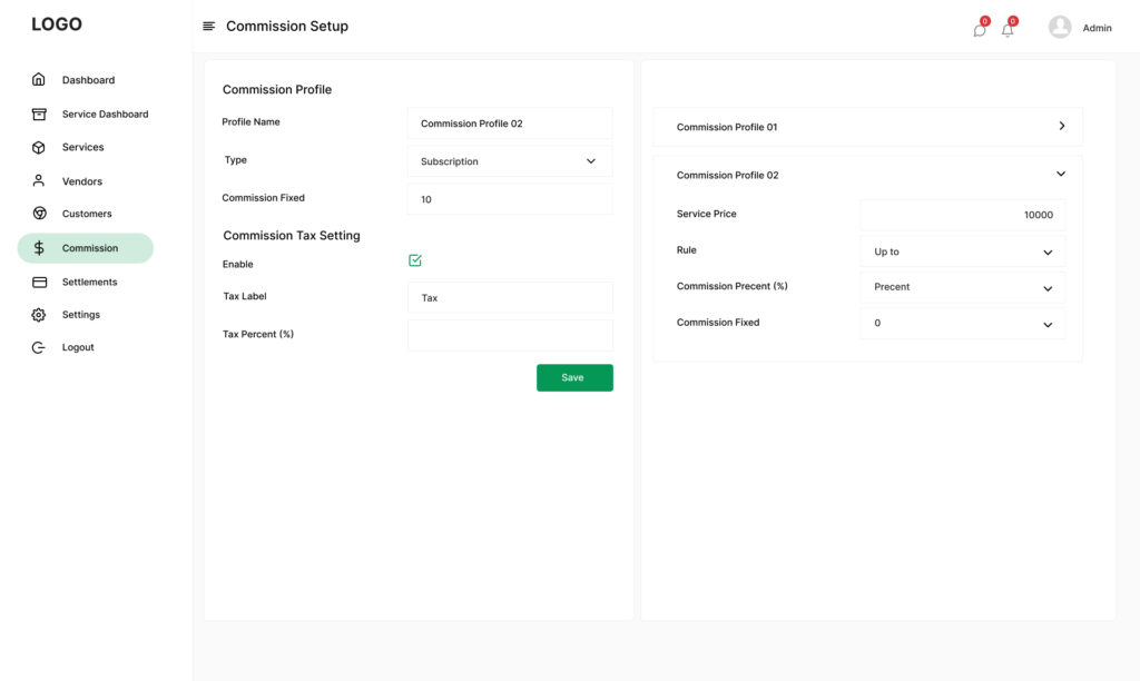
Admins would finally have a real dashboard — not just a spreadsheet or inbox — where they could review vendor profiles, flag reports, and take actions like blocking or warning users.
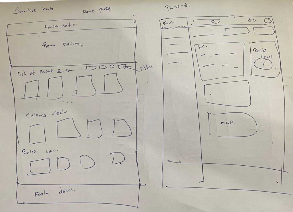
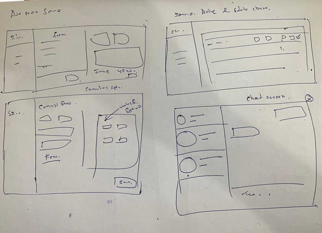
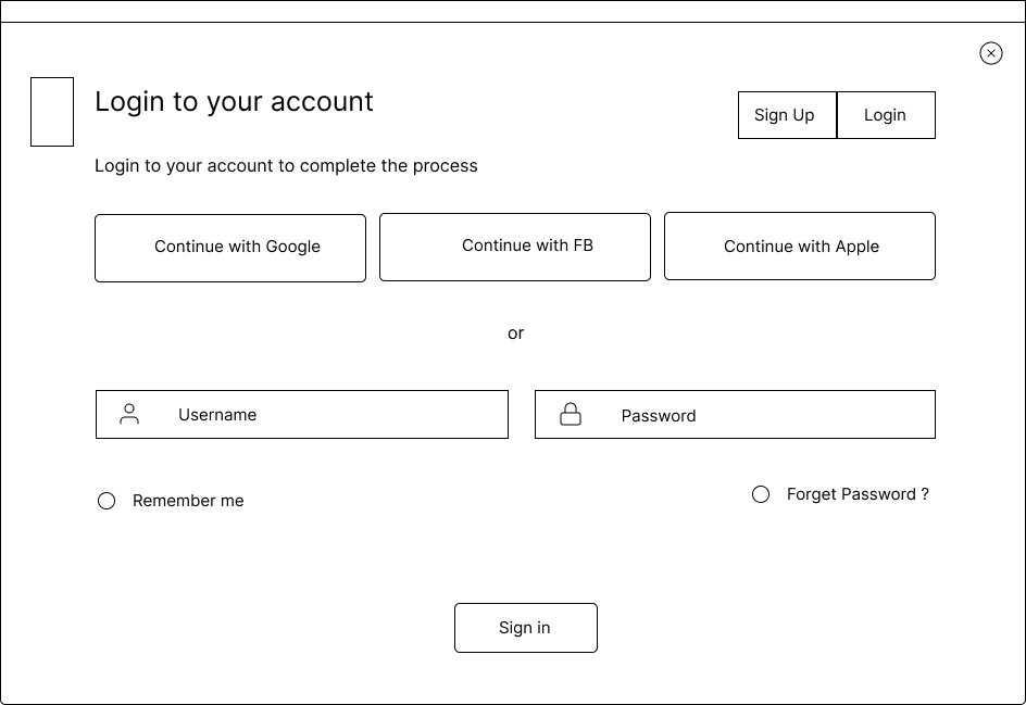
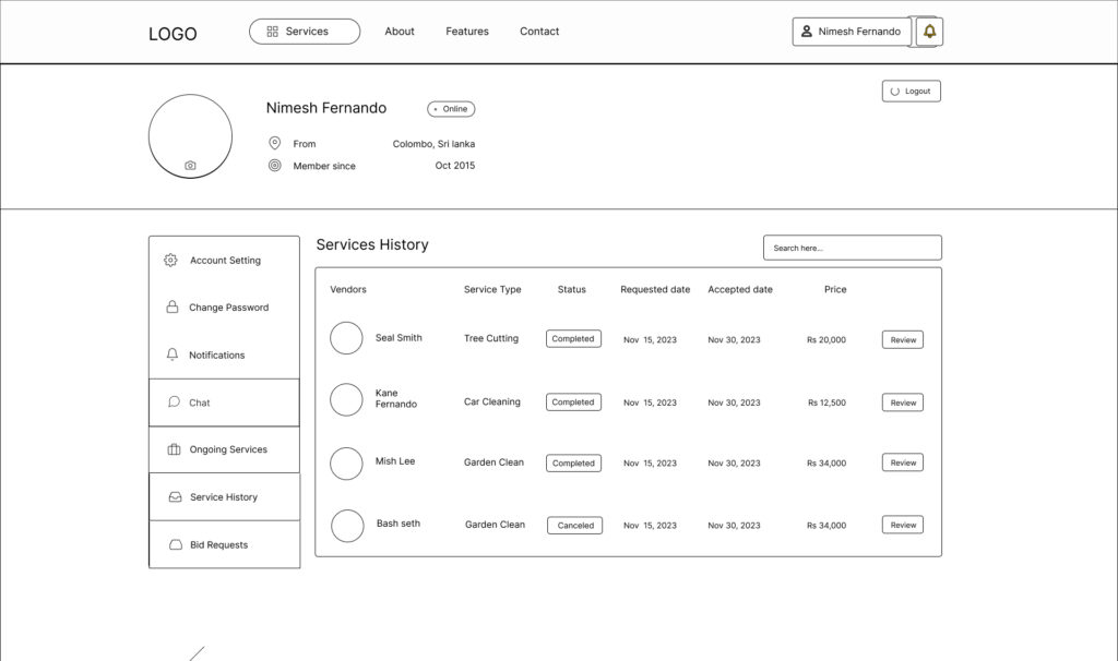
Mid Fidelity Wireframing
8. UI Design – Designing the Interface
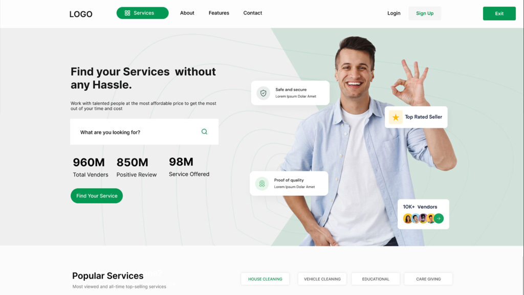
I designed the UI entirely in Figma, starting with mid-fidelity wireframes and gradually refining them based on feedback. I used a neutral, modern color palette with soft edges and bold action areas to help convey clarity and trust.
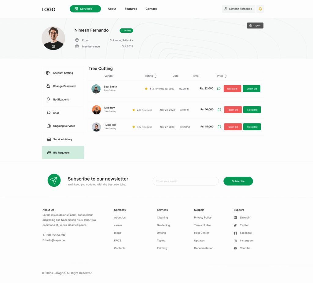
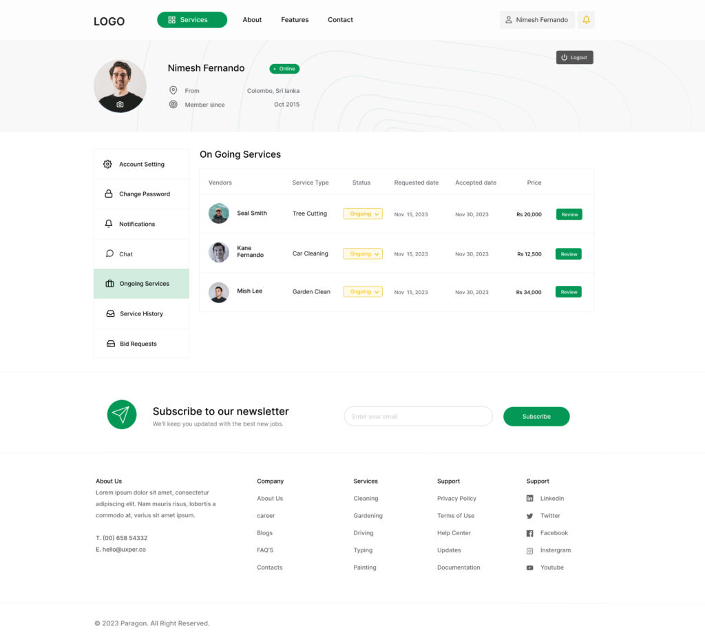
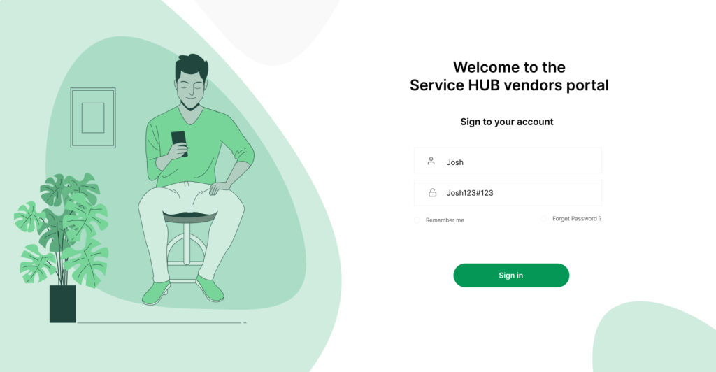
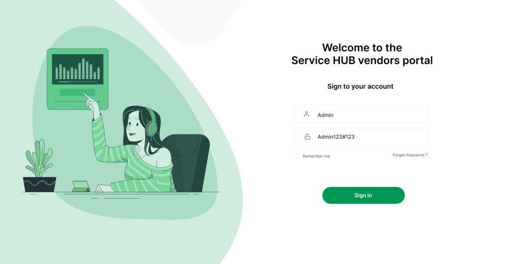
The customer-facing screens were clean and welcoming — with bold CTAs, clear ratings, and no surprise steps. The vendor view felt more like a business tool, with metrics and lead tracking front and center. And the admin interface had a modular layout with tabbed reports and quick-action buttons, so moderation felt structured and manageable.
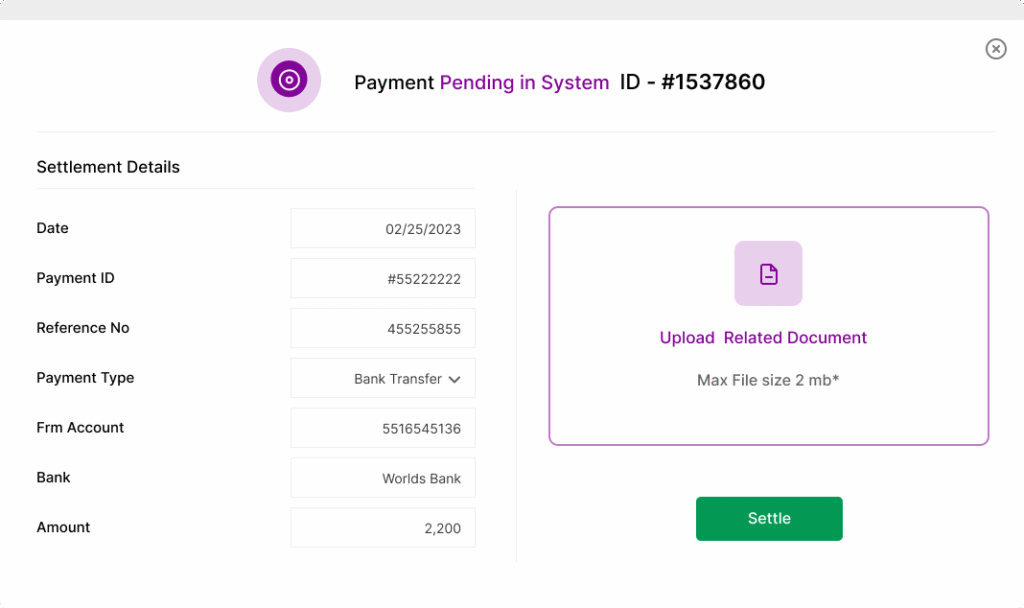
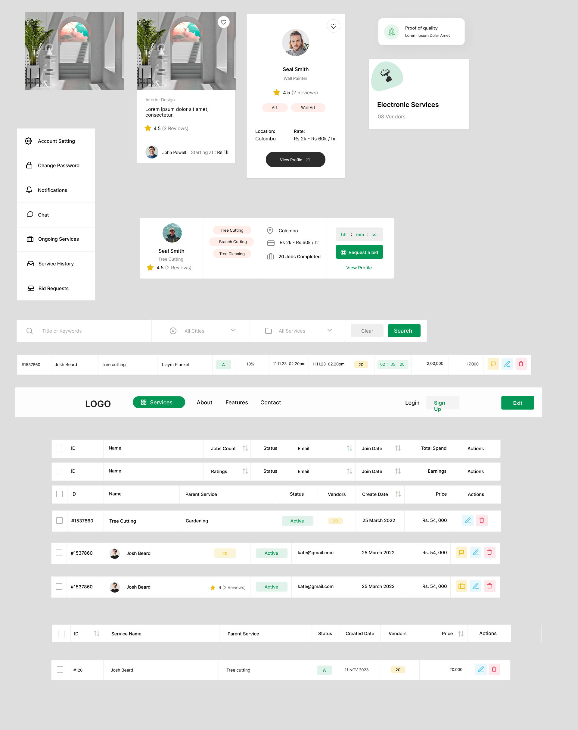
To ensure the platform felt cohesive across all roles, I created a shared design system of components: cards, modals, input fields, and more. This made it easier to scale and hand off clean files to developers.
Client Flow
Vendor Flow
Admin Flow
9. Testing and Iteration
Once I had a clickable prototype, I put it in front of five users — two customers, two vendors, and one admin. I wanted to know: was it clear? Was it trustworthy? Did anything feel confusing?
The feedback was both validating and insightful.
One customer said, “This feels way easier than what I’m used to. I’d actually trust this.” Another user noted that the booking flow was too long — so I reduced it to just two steps.
A vendor mentioned that the filters were buried — I brought them to the surface. And the admin view felt overwhelming at first, so I grouped controls into tabs and introduced summary dashboards to help them quickly scan platform activity.
Every comment led to a small but meaningful iteration. And by the end, the prototype felt more focused, more usable, and more trustworthy.
10. Challenges – What was hard?
Designing Service Hub wasn’t smooth sailing. While the idea was strong and the vision was clear, the reality of building it — solo, in just four weeks — came with its share of challenges.
The most obvious hurdle was time. With only a month to go from concept to clickable prototype, I had to make fast decisions. There wasn’t time for polished personas or deep analytics. Instead, I relied on real conversations with people I trusted, prioritizing speed over scale — without sacrificing insight.
Then there was the scope. This wasn’t just a single-user product. It had to serve three completely different roles — customers, vendors, and admins — all with their own goals, needs, and pain points. Balancing their priorities meant constant trade-offs: simplify one dashboard without weakening another, or cut features that would have added depth just to meet the deadline.
The platform limitations were another constraint. Since this was an MVP, there was no real-time payment system or built-in chat — only mocked-up flows. That meant I had to design in a way that made the experience feel real, even though some interactions were still imaginary.
Finally, working mostly solo meant I didn’t have a team to bounce ideas off of. There were moments where I wished for more feedback — especially during user testing or complex flow design. I had to rely on my instincts, my research, and the occasional developer check-in to keep moving forward.
Still, despite the pressure, the constraints actually helped. They forced me to stay focused, prioritize ruthlessly, and make design decisions that solved real problems without overcomplicating things. And in the end, they helped shape a prototype that felt clean, fast, and usable — even in its earliest form.
11. What I Learned
This project wasn’t just about shipping a working design — it was about understanding what trust really means in a local service economy.
I learned that people don’t need fancy features — they need to feel safe. Vendors don’t just want exposure — they want control. And admins aren’t gatekeepers — they’re facilitators of quality.
Even with limited time and solo execution, I was able to build a working, testable MVP that connected three very different types of users around one shared goal: making service exchange simple, transparent, and fair.
There’s still more to do — payment and messaging are coming next, along with a mobile version — but Service Hub now has a solid foundation that was shaped entirely by the needs of the people it serves.

